We Think It’s Time For Illinois To Get A Better Looking License Plate
After having traveled to several different states in the last year, I now have license plate envy. And these 8 new designs are all better than what we have now.
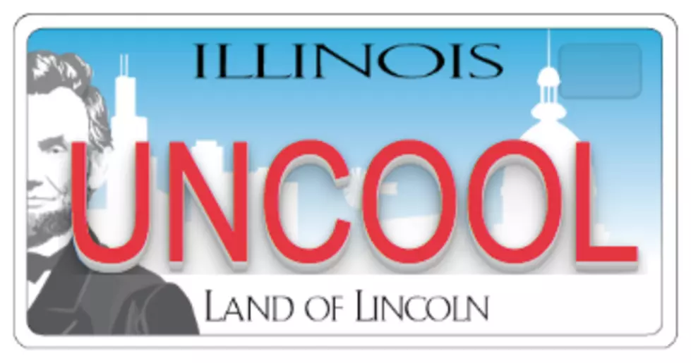
It wasn't that long ago the Illinois update the look our license plates, but as Chicago-based marketing agency, Ivor Andrew, points out, it's still on the unappealing side. Actually that's not what they said. This is what they said:
What’s wrong with the Illinois plate?
- Abraham Lincoln’s half-cropped face.
- Utterly brutal typography. It’s stretched not only horizontally on the state title, but vertically on “LAND OF LINCOLN.” And if it wasn’t bad enough type already, they used it as small caps, which distorts it even further.
- Most cars have license plate frames, and those frames completely hide the “ILLINOIS” section. Less than ideal.
- Thanks to Lincoln’s half-cropped face, reading the first letter of an Illinois license plate is often a guessing game. Legibility seems rather important when it comes to plates, no?
- Finally, there are skylines from Springfield AND Chicago in the background. Gotta have everything!
And in my opinion, since I haven't left the state as so many others have, we deserve a nice, new, shiny gift for staying.
In just 8 short hours, these extremely talented artists created 8 new ideas and I think most are better than what we have now.
These are my favorites:
To see Ivor Andrew's 5 other creations, click here.
[H/T: Medium.com]
More From 97 ZOK